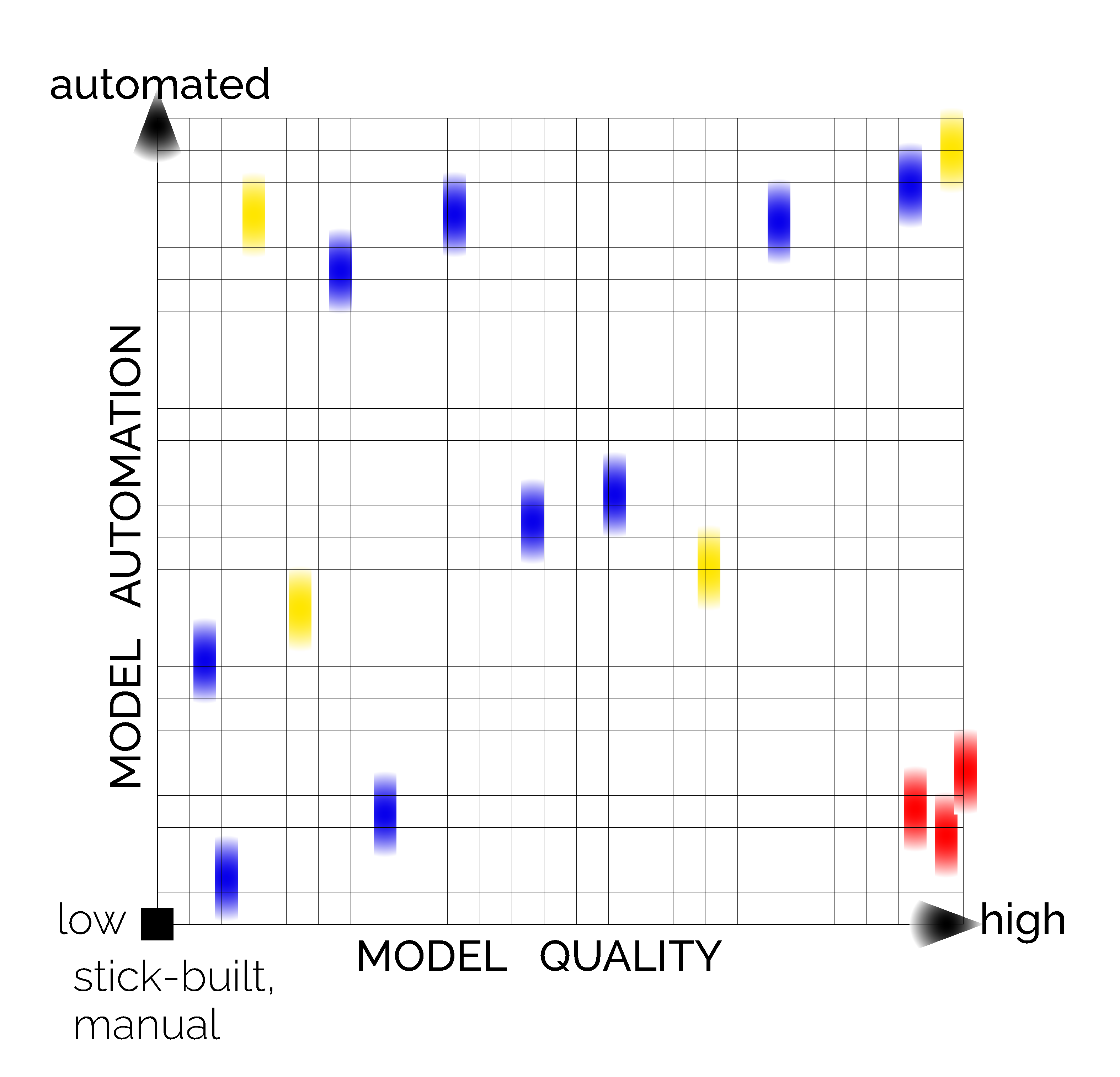
I invite you to think about your own AEC projects and place them on this graph. The Y axis is degree of model creation automation, from stick-built by hand at the bottom, to fully automated (by any means) at the top. The X axis is model quality from poor on the left to high quality … Continue reading Model Automation and Model Quality on a Graph
Copy and paste this URL into your WordPress site to embed